6 minutes
Building a New Portfolio Site
Why?
That is always a good first question… Why? Why do I need a portfolio site? Can’t I just use LinkedIn like everyone else?
First off, I’m trying to do more things for me and not for recognition or attention. I am not under any impression that what I put on this site will be read by anyone. Anyone looking to work with me will probably go to LinkedIn and contact me via that process or maybe they will dig through my GitHub account (both linked on the home page of this site ✔) and go from there. Either way, this is the less likely avenue.
So… why do all of this?
…because
For one, building sites like this (and my previous version) help keep my lesser-used skills sharp. I started my career off by focusing mainly on front end development. I was never all that great at it, but it was something I enjoyed and I have kept up with learning from my very first site built with Dreamweaver hosted on GeoCities through the moving trends of jQuery -> Angular -> React -> insert weekly new framework here – I’m not sure what the hotness is now, maybe Svelte? I haven’t touched that one yet. I may do a weekend project in that one day because I am getting frustrated with how difficult React is to work with lately (but that’s a topic for another day 😅).
Old Site
A few years ago, I went though the internal debate above and created the original version of rossbrandon.dev. It was built in React using Gatsby. The theme was borrowed from one I found on the internet and thought was very cool. I adjusted it to remove some of the flashiness, but include enough flair to have fun with. That “flair” became the reason that I rebuilt it.
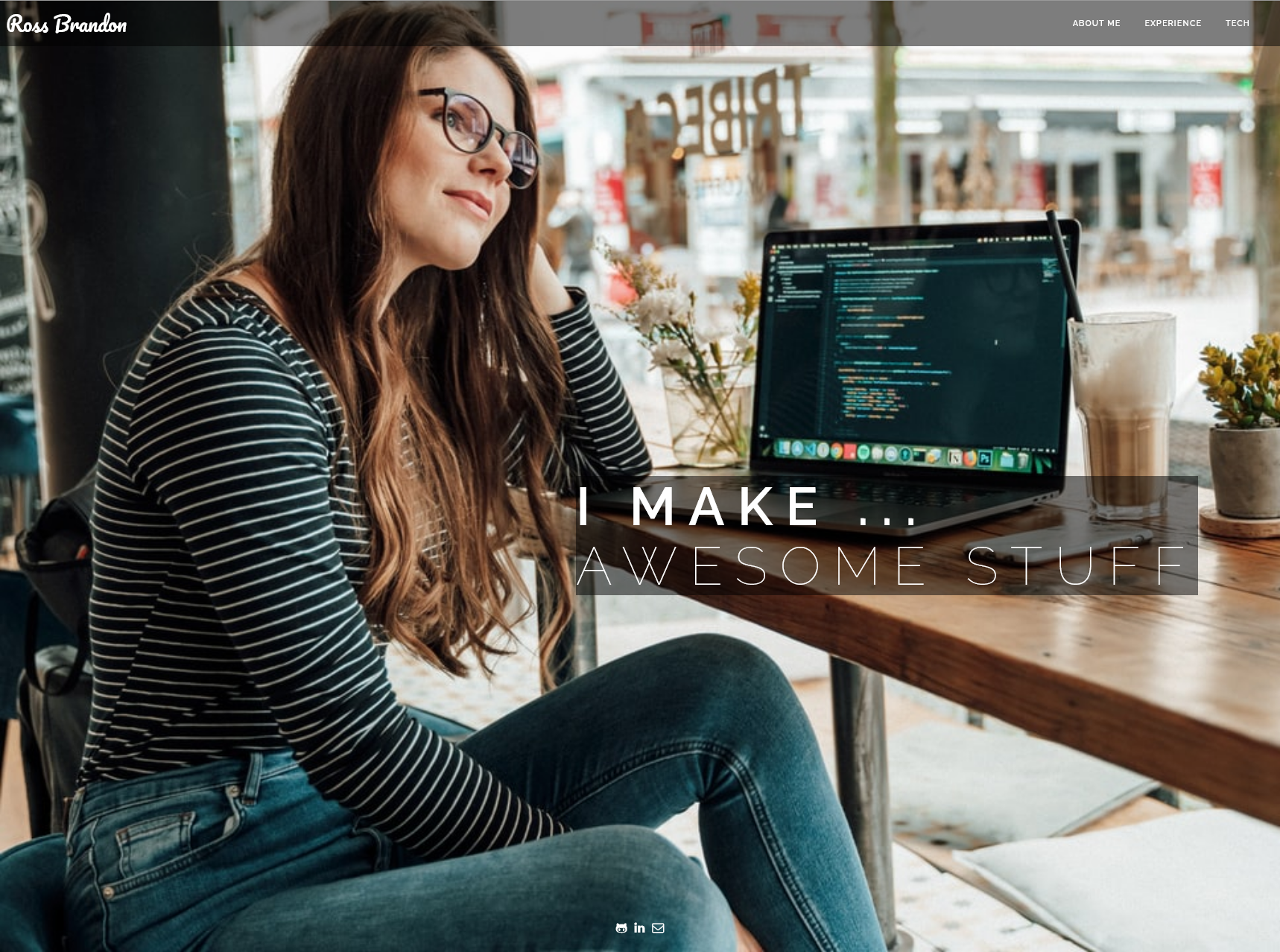
I used the Wayback Machine to grab a couple screenshots from a few months ago and it immediately validated why I wanted to change this design. From the get-go, it is clear that this site’s focus was not on me or anything that I’ve done. It is just a “show-off”. The full-viewport-size image is pulled from an Unsplash collection which rotates images upon different visits over time. That is neat, but as evident in the screenshot below, that is not me on the cover. In general this is fine. It’s a cool photo, but if this is my portfolio site, it does nothing to describe me or my experience except in the generic sense of “hey, this person looks like a developer and is in front of a laptop with some code gibberish on it.”
For further context, the text in the screenshot below typed out character-by-character each line (then backspaced it to "I MAKE" and continued again):
"I MAKE CLEVER APIS"
"I MAKE EFFICIENT MICROSERVICES"
"I MAKE FAST WEB APPS"
then finally "I MAKE ... AWESOME STUFF"
This was a fun little piece to tweak (I didn’t even write the original code!), but it really didn’t serve any purpose other than to vomit out buzz words 🫠 – so out it goes!

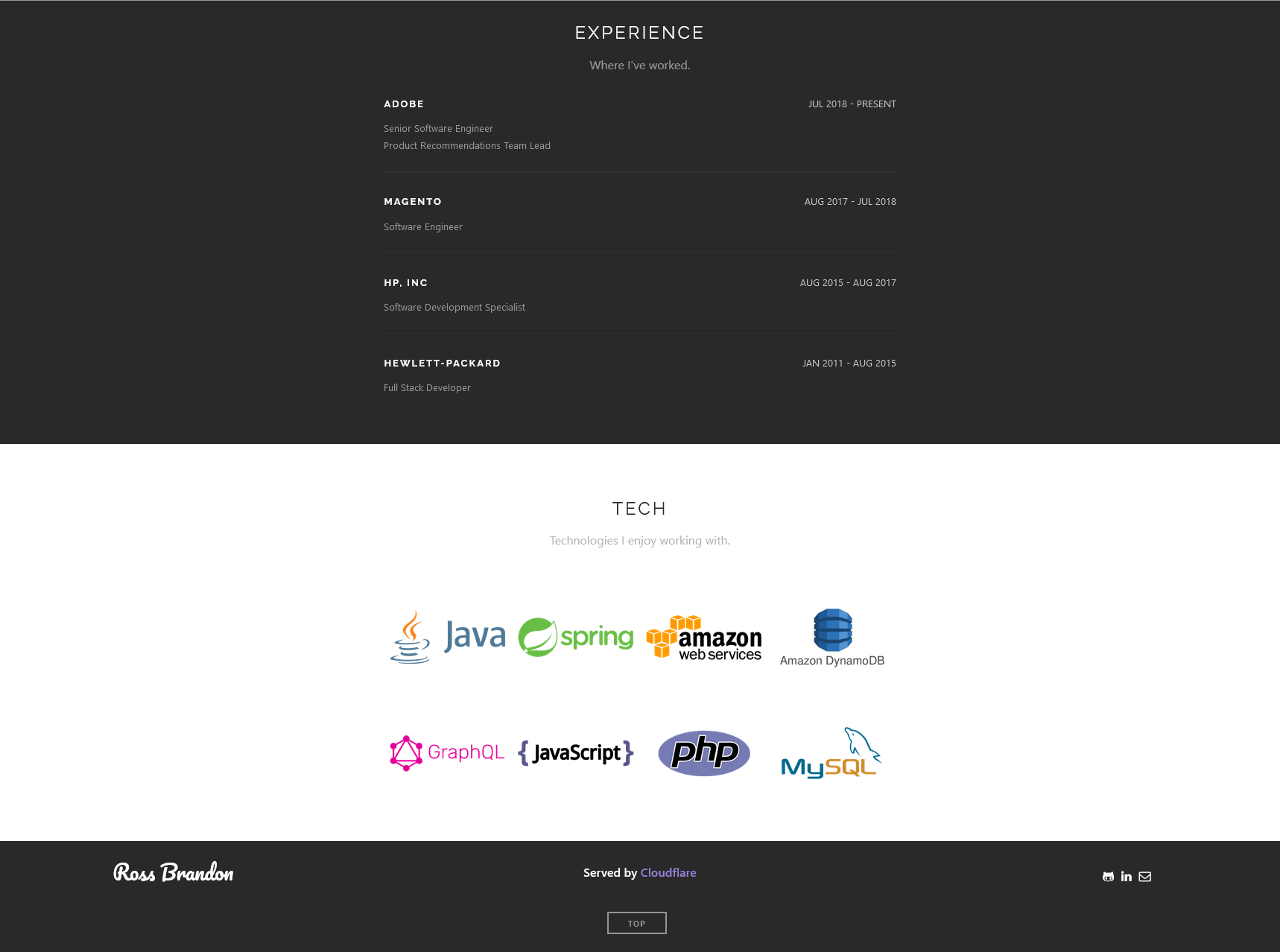
The second half of the original site, is still mostly fine. It was simple, elegant, and described my experience up to that point very effectively. The problem with it is that it is just too basic. It did not provide any information that you could not get in greater detail from LinkedIn and it did not provide a way to expand it without changing its layout and losing the simplicity that was its value. So out it goes as well!
The TECH section was neat at first, but as I grew the technologies I worked with, I was never realistically going to come back through and update these. Especially given the tedium required to find all of these logos and size/color them correctly to match the style of the others. It frankly wasn’t worth it.

Visually, the site was nice. But at the end of the day, it just did not feel like me. I had originally added (and promptly removed) a section for projects that I had worked on but I found myself not even wanting to visit the site myself much less keep it up to date or add to it.
A Few Years Later
Here we are in mid 2023 (1st of July to be exact) and I have finally mustered up the energy to try this again. This time a bit differently…
I had a few goals in mind when going about this, but it does take a lot of time and there are many things I want to do with my week off (including non-project related activities like simply playing Final Fantasy XVI or Diablo 4 🙃).
Here were my main requirements:
- I wanted to learn something new.
- I wanted to try keeping a personal blog – for me.
- I wanted something simple. Something I didn’t mind visiting or being visible to others if they found it through Github, LinkedIn, or other professional conversation.
- I wanted to move from Github Pages to Cloudflare Pages
These turned out to be fairly easy to address:
- Hugo is the answer - Hugo is written in Go which I have been actively learning as of late (I will create a separate post about this in the future). It provides a very awesome/fast static site generator and scratches the itch of continuing developing Go prowess.
- This site is for me. If for nothing else, to help me get thoughts down and keep track of things that I want to document.
- Hugo's Themes are awesome! There are hundreds of them and they are extremely easy to use. This is great for me because while I enjoy web development, I am a very terrible designer. I love how easy the Hugo themes are to pick up and modify as I see fit.
- I’ll be the first to admit that I’m a Cloudflare shill. I love it. It’s a great product for everything web related. I also did not like how complex the Github Pages setup can be for some static site generators. In my previous iteration of this portfolio site, I had to use TravisCI to build and deploy the Gatsby site to Github Pages (since I did not want to use Netlify at the time). Since Cloudflare still fronted the site, I had to have the TravisCI build clear the Cloudflare cache on any change. With Cloudflare Pages, the Hugo integration is native and all I have to do is link my Github account and Cloudflare will redeploy any changes on a push to the
mainbranch. That reminds me… I need to step away real quick to delete that API key
Is It Perfect?
No, nothing is. However, it is a surprisingly easy site to manage and navigate and I think I can expand it enough to meet my needs here.
Things I want to add:
Ability to pin blog posts for ones I want to keep updated (ex. reading lists)✔- Blog post table of contents
- Project demo section to show off a few things I have built over the years
I am still very much in the early stages of learning Hugo, but I think I will enjoy making this site a better fit for me. For additional fun, it should be easy enough to try out various themes if I feel so inclined.
And this site is still served from Cloudflare, so… some things never change. ⚡