5 minutes
Building Spendy Part 2
And Continue I Did
If you have not already, please begin with part 1 of this series.
While the first version of Spendy was a perfectly fine and usable product, I became less satisfied with it as time went on. It was not very modern and lacked a ton of nice features that I wanted in a budgeting application.
In addition, I wanted to push my developer limits a bit. At that point, I had a lot of experience in building MVC applications and I wanted to do something a bit more modern. I wanted to use a modern Node.js framework on the backend, a standalone React app on the frontend, and a “NoSQL” database instead of a relational DB.
Stack
This is the tech stack that I landed on:
Frontend
The frontend is written entirely in React, but uses a theme that I acquired off of ThemeForest because I am still awful at UX. The theme uses sleek looking dark backgrounds with brighter contrasting colors for text and buttons and I was extremely pleased with it visually.
- ReactJS
- Theme from ThemeForest
Backend
NestJS is a comprehensive and very clean Node.js framework that made building a GraphQL API a breeze.
Hosting
The frontend hosting strategy was much easier in Spendy v2 because it was a static React application and not a full-stack MVC application. To host this, all I had to do was create a Github organization spendyapp and deploy it with Github Pages.
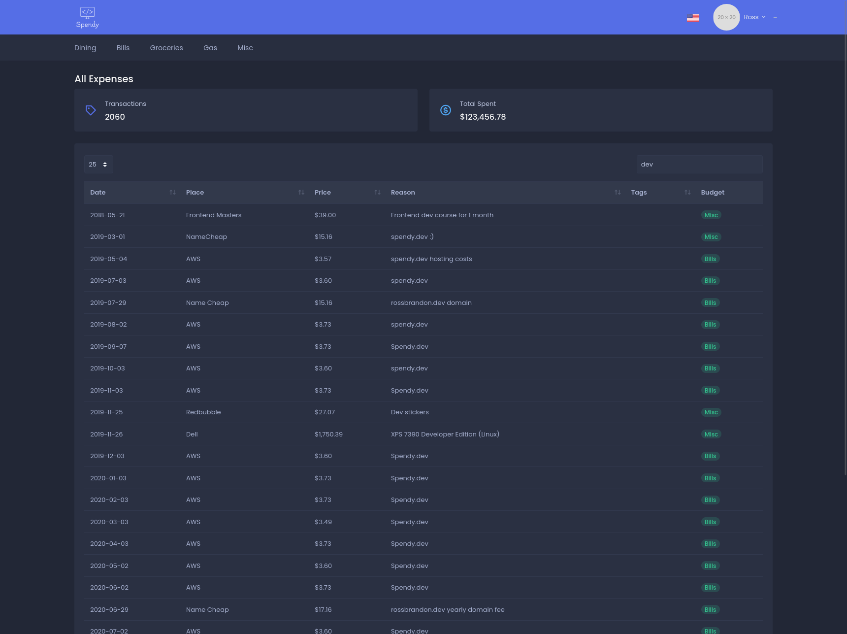
For the backend NestJS server, I went straight for AWS Lightsail this time around. Running a small instance still cost ~$3/mo (this can even be seen in my example All Expenses screenshot below!) and offered way more performance than my small personal application required.
For the database, I leverated a free tier cluster on MongoDB Atlas which, again, offered much more performance than I needed. I have nothing but positive things to say about MongoDB’s free tier offerings. Getting started and using these clusters could not be easier.
UX and Functionality
Tada! Already, the UX is leagues ahead of Spendy v1. Lets take a minute to go through each of the main areas of the application and it’s features.
Landing Page
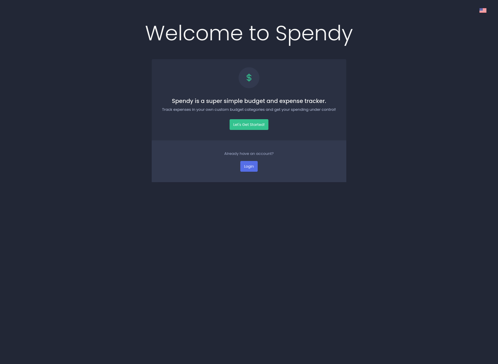
The landing page below is what we would see if we were not already logged in. It provides a basic description of the application and a Login button. Authentication this time around is not managed by Spendy itself, but by Auth0.
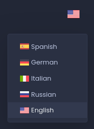
Multi-language support is built-in! Basic page translation can be set by clicking the flag in the top right corner and selecting our desired language from the local switcher:
Dashboard
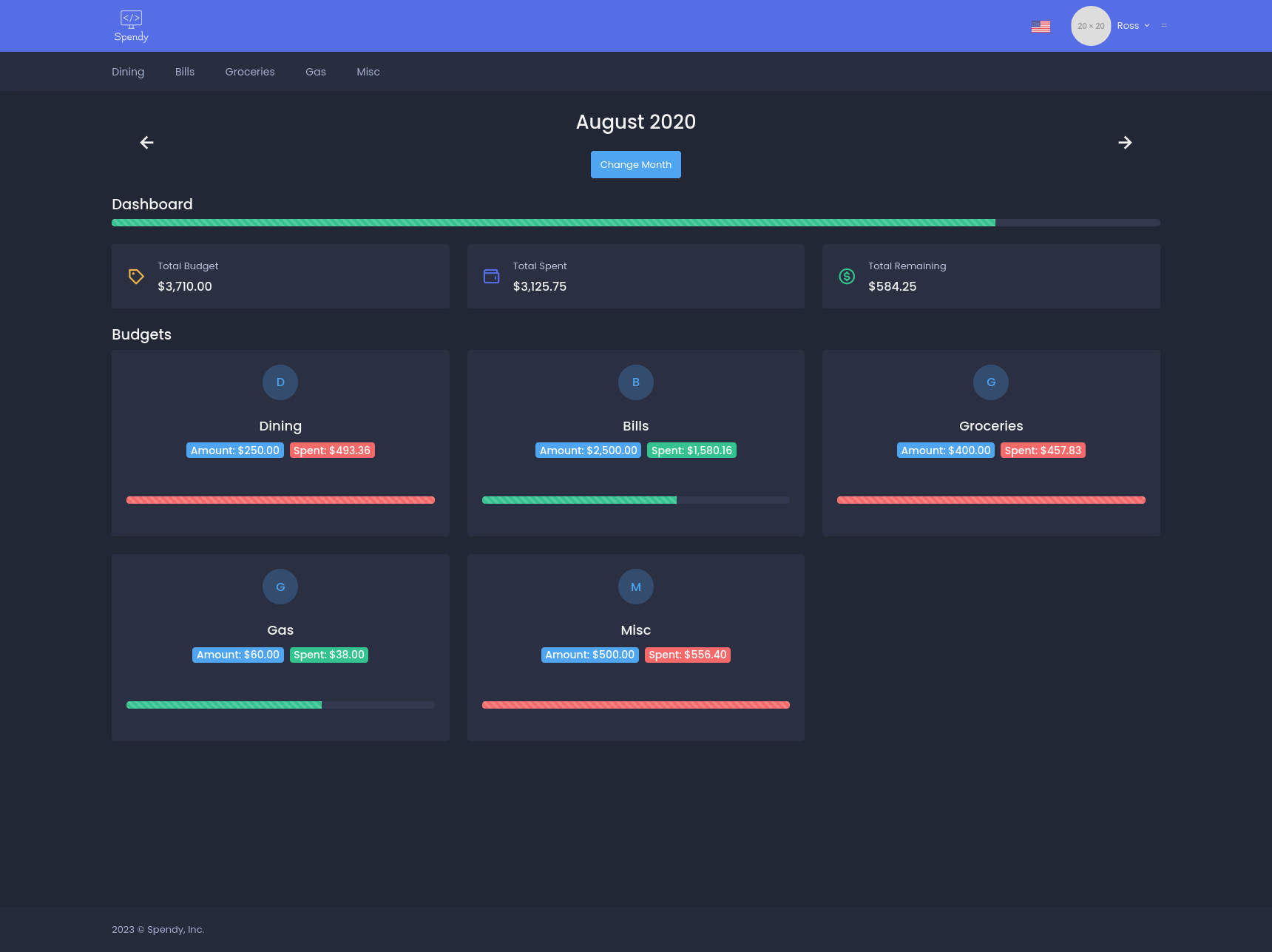
We’re in! After logging in via Auth0 (using Google, Apple, Facebook, Github, etc), we’ll be redirected to the Dashboard. The view will default to the current month and show similar at-a-glace information as in Spendy v1: a percentage progress bar and numerical representation of total budget vs total amount spent and the amount left over for the given month.
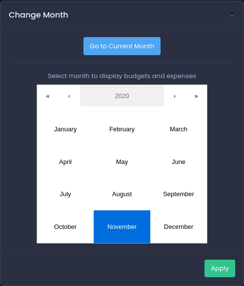
The currently viewed month can be switched by clicking the left and right arrows or by clicking the Change Month button and using the month selector modal:
Expenses
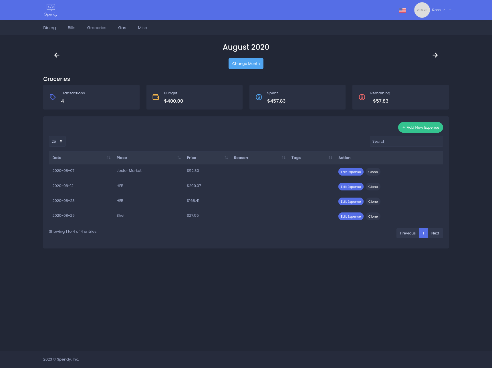
Clicking on a budget from the dashboard shows all expenses under that budget for the selected month:
Add a new expense
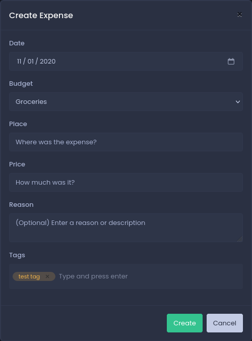
Clicking Add New Expense opens a modal on top of the page and allows us to easily add a new expense to the currently viewed budget.
Fields:
- Date: defaults to the current day if viewing the current month, or the first day of the month if viewing a past or future month.
- Budget: dropdown of all the available budgets
- Place: name/place of the expense
- Amount: amount of expense
- Reason: longer description of the expense
- Tags: type and hit enter to add a list of tags used for categorizing and filtering
Search all expenses
View and search all expenses by clicking the user dropdown in the navbar and selecting All Expenses (this takes a lot of time to load as it pulls all data from the MongoDB collection and uses JS to search and sort the results locally):
Budgets
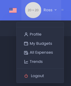
View and manage your created budgets by clicking the user dropdown in the navbar and selecting My Budgets.
User Dropdown:
My Budgets:
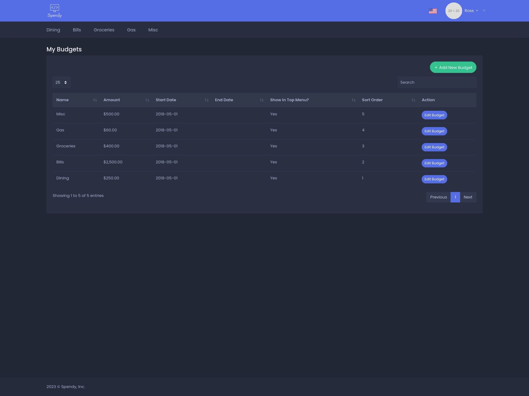
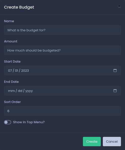
Create a new budget
Fields:
- Name: name of the budget
- Amount: amount allocated to this budget
- Start Date: date the budget will take effect
- End Date: optional date that the budget will stop taking effect
- Sort Order: display order of the budget in the list
- Show In Top Menu?: toggles whether or not this budget is displayed in the top menu nav bar.
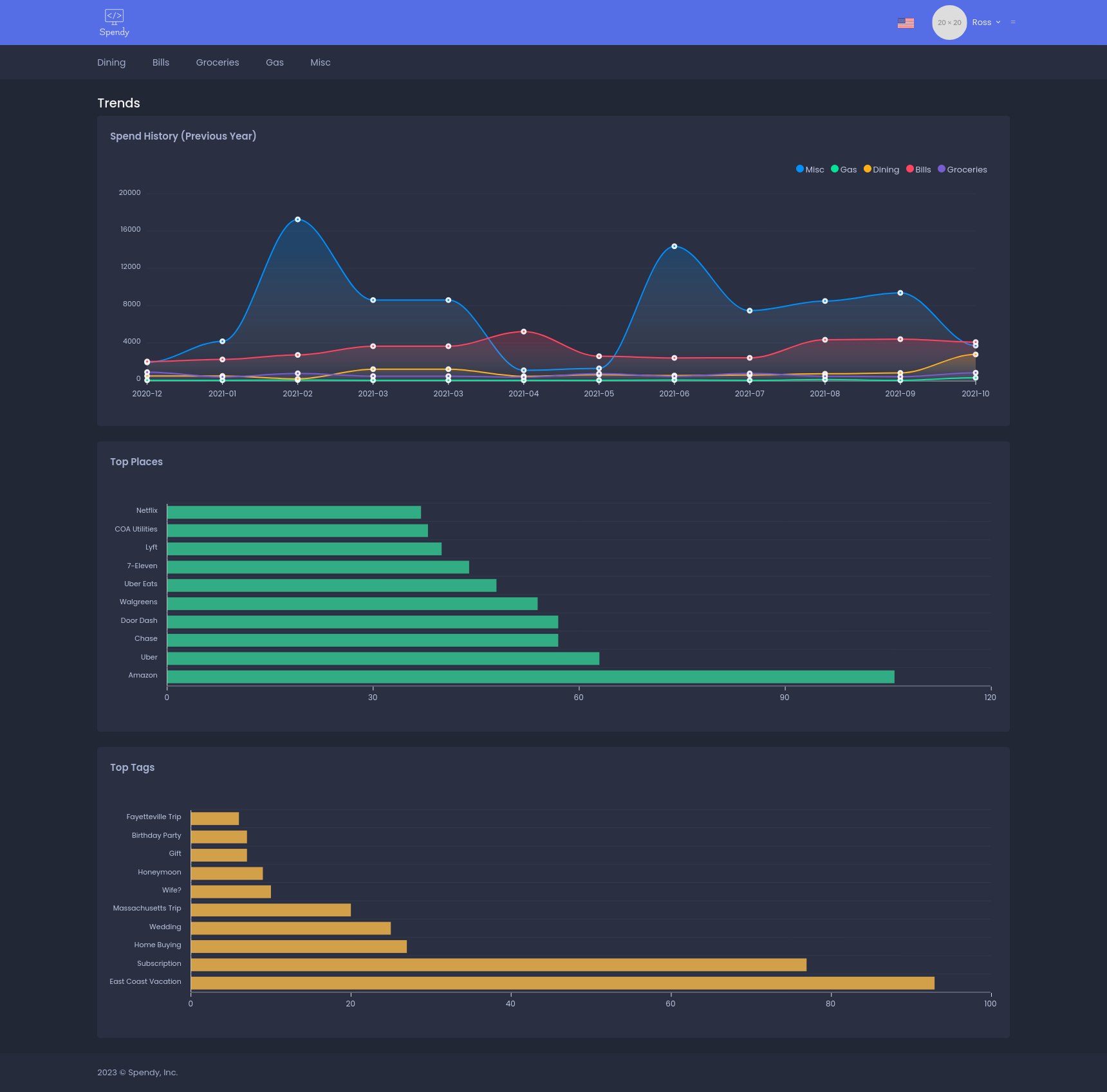
Trends
View historical trends by clicking the user dropdown in the navbar and selecting Trends. This was my favorite feature to build. Using MongoDB aggregations and Apex Charts I was able to create some simple yet powerful data visualizations. I am definitely a data nerd.
Do I Use It Today?
Sadly, no. I no longer use Spendy. I had accomplished the goal I set out to of building something cool and I eventually outgrew it. Ironically (perhaps hypocritically), I ended up missing the automatic import of transactions, the smart categorization, and wealth management tools that more proper applications provide (I still hate Mint). Overall, I truly believe it did help me get a better handle on my spending and money management, though. Especially due to the fact that all of the expense data had to be entered manually. There is still some simplistic beauty in that, I believe.
What do I use now? Copilot. Copilot is one of the sleekest apps I have ever used. It does have the limitation of only being available as an iOS (iPhone only) or Mac OS application, but I have hopes that they will expand to an iPad and web version in the future as they grow. I highly recommend giving Copilot a try if you want an intelligent money management application that goes far beyond simple budgeting.
And no, I am not associated with Copilot in any way, I am just really impressed by their product 😄.