16 minutes
Designing Data Systems for Visibility & Management
What Do We Mean By Data Management?
In short: Data Reconciliation.
Specifically: providing and exposing the needed visibility around system-to-system data flows to enable supportive and correct actions to ensure data integrity for our users and our internal operations.
Designing with Data Flow Visibility OOTB
I have spent a lot of time in my professional career thus far working to ensure that data in system A is as expected in system B. Turns out, this is so critical that entire teams have been formed just to create and manage tooling to perform these reconciliations. I know because I was on one of them. Most of the tooling I have created around these efforts was an afterthought to the main business applications. The problem with this approach is that it tends to create an environment where data tracing, data visibility, and data management tools are created after the fact and from an “outside looking in” perspective instead of baked into the products we design and build.
In this post, I intend to explore that process a little bit and address why “baking in” and designing solutions with this mindset at the forefront can help avoid future stress and improve the performance and reliablity of data systems from the onset of the project.
Can We Just Do This Later?
Let’s face it… we won’t. And when we have to, we won’t want to and the level of effort will have increased substantially. In some cases it might even turn into someone’s entire job.
Ok, Let’s Get On With It
A (Potentially) Real World Example?
To set the stage of our discussion, I have created a super basic system diagram (using the awesome Excalidraw diagramming tool!) to lay out a fake application landscape that accepts data generated from a user (uploaded or through user actions & events) and distributes it to many internal consumers to enable some sort of end-product functionality for that user – real use cases may vary.
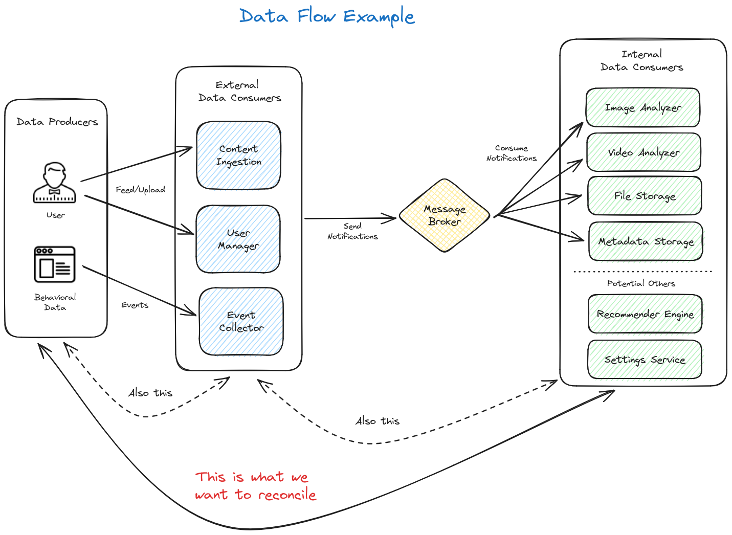 (Diagram created with Excalidraw)
- On the left side, we have the data producers. Or, more simply put, our user generated data.
- In the middle, the external data consumers accept that data through feeds and uploads or though events such as behavioral data captured through browser interactions, etc.
- On the internal (right) side, these upstreams systems send messages/notifications about this data to downstream internal data consumers representing, in this example, the services that power product functionality such as search or machine learning systems.
What Are We Trying To Do Here?
Our basic goal in this example is to determine if all of the data on the left side is correctly represented in its end state on the right side. Going one step further, we want to see analysis on the flow from the user to the external data consumer (our collection side) as well as flow from the external data consumer to internal data consumer (end state/product applications) to ensure our internal operations are working smoothly.
- The former is typically what the user cares about since it tells them that the products they are trying to use will work correctly.
- The latter helps us internally to identify and debug potential issues between our internal message streams.
How Can We Do This?
Let’s explore a few ways we can accomplish these goals at a high level using our simple example above.
APIs
Creating APIs in each of the systems to provide the aggregations and detail we want visibility into is critical.
Client Side
Depending on the product we are providing and the design of our systems to support it, we may or may not have the ability to retrieve information in real time about the source data we care about. For example, if our user is a phone client that is uploading images to our image analysis and search service, we might not be able to query that device in real time to see how many images we should expect to receive on our side. We might only be able to know what we have received and can only use that metric as a starting point (ie. what the user has elected to send us).
If we control the client (ex. an image upload webpage or phone application), we may be able to retrieve count aggregations and metadata (ex. the user uploaded 1253 images out of 1500 total images on the device) and determine if that is the complete data set we expect or if there was a problem in the data transfer from the client side. From there, we can either feed this up to our services as a “manifest” of sorts or make it available to our data management tooling via a beacon or API in the client application. Again, the method of obtaining this information is highly dependent on our design and privacy/user annoyance tolerance.
Ideally we would want to create an API, beacon, or manifest feed that provides the following aggregations:
- Total documents marked as sent
- Total (relevant) documents on the client
- Error states in aggregate or error telemetry
- Ex. Failed to send data to the collector endpoint due to bad data format
Service Side
On the services side, this gets significantly easier because we typically have much greater control over these systems – locked down third parties are excluded from this example as they may require more effort.
In each service that we want to track as part of our system’s data journey, we ideally want to create some form of the following APIs:
- Total documents received per-tenant
- Options to filter on:
- Date Range
- Any relevant metadata that a downstream system’s ingestion may filter on such as if an image is marked as public/private
- Options to filter on:
- Document detailed metadata by id
- Error states in aggregate (and by document id if possible – this can be expensive depending on data size)
- Ex. Failed to send 23581 notifications from the event collector to the message broker due to network error
Bonus
Create an API to retrieve all document ids for a given tenant. Depending on our data size, this may need some design work to keep costs down as querying for all document IDs on a large data set in real time can be quite expensive. The benefit of this, though, is substantial. If data is submitted in bulk by our users (millions of documents), it is handy to be able to identify the problem subset of documents rather than deal in total aggregations. Resubmitting the entire dataset becomes more time consuming and more expensive as the data grows.
Actions
The above APIs helps us create visibility into how data flows through our applications and systems both from the client and in our SaaS environment. We will explore a bit more of how these can be used to providing meaningful and actionable data, but what else could we do here? We could also go ahead and create APIs for performing some very powerful mutations on these data sets to manage our tenant’s data:
- Executing re-sync/re-submission of data for a given tenant to downstream systems. In the event of an error in data flow, we can expose the ability for authorized internal users (or the client’s themselves) to initiate a full re-sync of data either from the client or from upstream to downstream systems. This can go a long way in resolving issues with a simple API call that can be exposed via management UI or built into other tooling and automations.
- Deleting data for a given tenant. With the rise of privacy defense and regulation like GDPR, baking in methods for deleting tenant data on request from the beginning can reduce an otherwise very expensive and time consuming compliance request to something as simple as a click of a button from our client application or internal support tooling.
Bonus
An awesome next step is to build in delete patterns for our notifications/message brokers so that downstream systems can react immediately without requiring further manual action.
UI Tooling
Note: I am not an UX designer and the examples shown here are poorly constructed widgets that I threw together using The Tremor React Library. Don’t judge me… I’m a data guy.
While the solutions we are discussing here should be API first to enable internal consumers to build their own tooling off of a centralized data management platform (think event based data deletion tiggers, automation on data reconciliation analysis, etc), I do not want to discount the value of having good UX around this data. We have the ability to create powerful interfaces for both internal teams and our users themselves if we see fit.
External User Facing View
If it is valuable to our use cases, we can put into our user’s own hands a scoped down view of their data so they can see in real time that their updates are flowing and that things are working.
External UI functionality ideas:
- Aggregation view for top level data flows relevant to the user. Skip middleware systems and show data flow from their end to the final destination relevant to the end user product that needs the data.
- Detailed (searchable) list of data if applicable (ex SKUs for an eCommerce synchronization system)
- Highlight errors and actionable items
- Provide ability to take action if needed
- Re-sync failed/missing documents
- Request their own data deletion
Internal User View
For our internal use cases we can create a multi-tenant, navigable, and detailed view to give the power of all of this data directly to our internal support and engineering users.
Internal UI functionality ideas:
- Client search - search and select a tenant to view data for
- Aggregation view for all relevant systems for a given client
- Drill down to detailed view for a given client and system
- Allow for management of data
- Deletion
- Re-sync between system A to X (ex. Content Ingestion to Image Analyzer)
Navigating Data Flows in a UI Example
To exemplify this, I have created a basic concept application called Data Flora. As part of this thought experiment, I like to think of data flows as living, growing entities that are expanding and thriving… like flora. And like flora, data flows need care and attention.
Note: I had a ton of fun making this app. It was a really good use case to throw together some concepts I have been thinking about for awhile as well as learn some new tech like Svelte, SvelteKit, and TailwindCSS. I also created a super basic Rust service to make the data side of things a bit more real 😄.
Githubs:
- UI code: flora-dash
- Rust backend: flora-api
Client Search
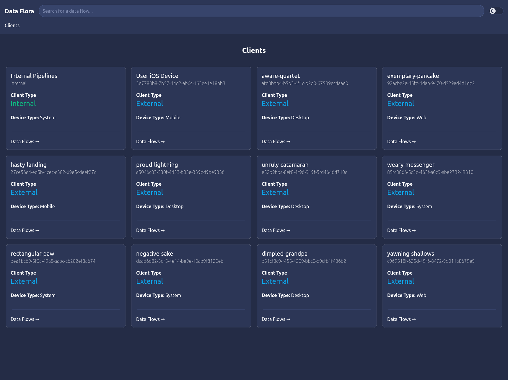 (UI prototype created with Svelte and Skeleton UI)
The Data Flora application example represents an internal tool that engineering/support/etc could use to trace data flow statistics and errors as they come in from various clients and flow between systems.
The landing page show above is a list of all of the clients that we have visibility into. The search bar at the top of the screen can be used to filter these clients as there may be many clients feeding us data.
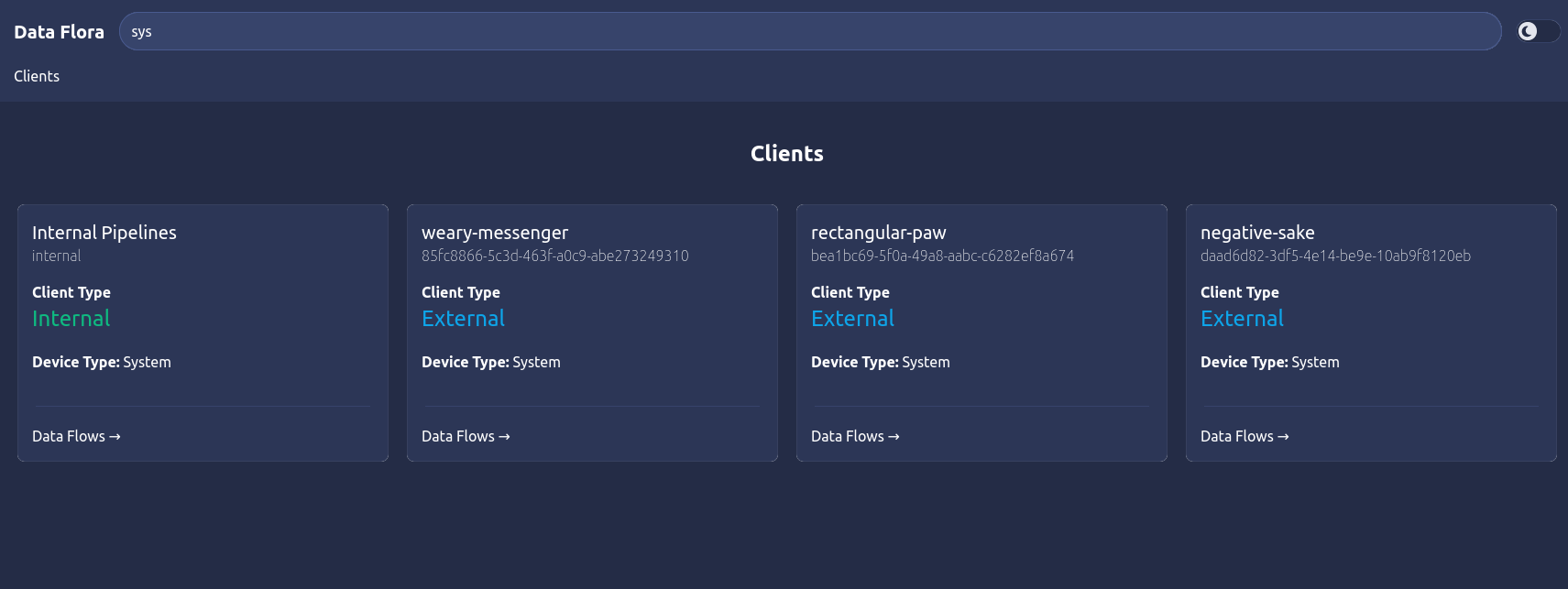
As an example, we’ll follow the flow of this UI from the perspective of a support engineer analyzing the data flow of an internal system-to-system pipeline. For simplicity, it will follow our example system diagram above describing an internal data pipeline: an upstream data ingestion endpoint named Content Ingestion that receives data feeds from clients and pushes messages to four downstream systems: an Image Analyzer service, a Video Analyzer service, a File Storage system, and a Metadata Storage system. This represents the internal side of this fake application’s data flow for all users. The first Internal client card in the client list screen above allows us to see this view. Other cards would represent individual clients that feed our systems with their individual data rather than the system-to-system flows as a whole that we will explore here.
Client Data Flows
So, to continue, we can click the Data Flows -> link on the Internal Pipelines card and navigate into this client’s first layer: the upstream data flows page.
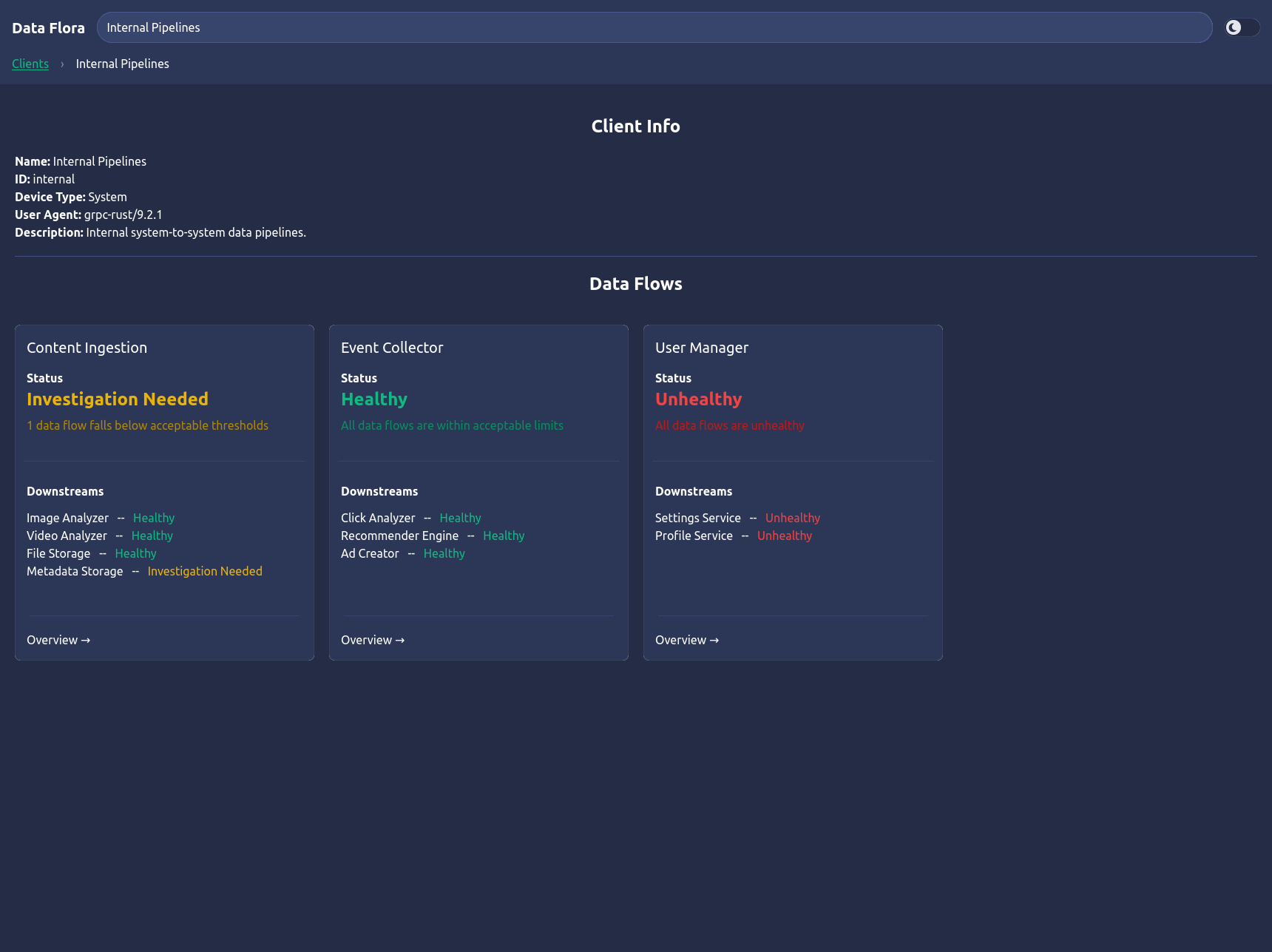
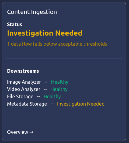
This page shows basic client information and all of the data flows that belong to it. In our example, we see the three main upstreams: Content Ingestion, Event Collector, and User Manager following our example system diagram. Each of these data flow cards show high level information about the state of each data flow including an overall and individual downstream system status: Healthy, Unhealthy, or Investigation Needed depending on the state the downstreams systems are reporting and the defined threseholds for status classifications (such as if data is still flowing, within acceptable error rates, etc).
Upstream Details
Clicking into the Content Ingestion card takes us to the upstream information page.
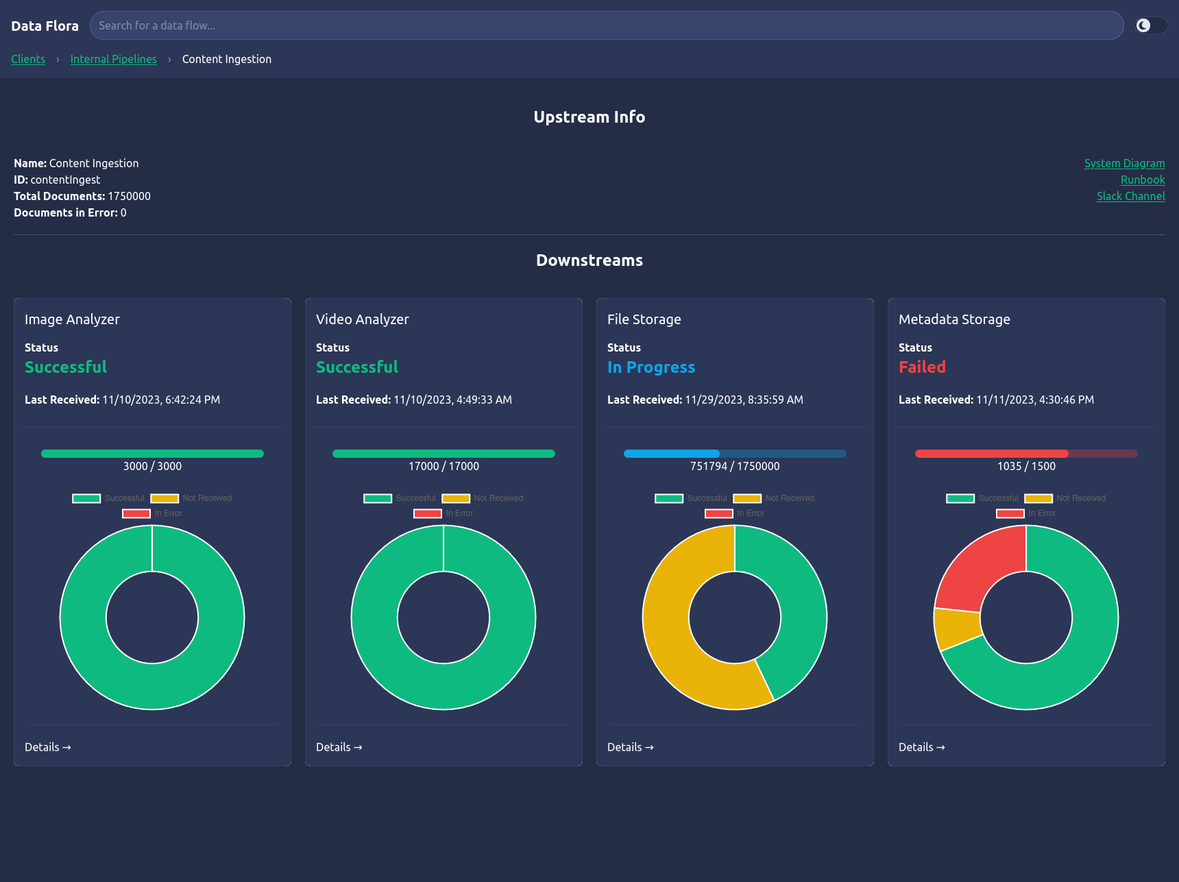
Here, we follow a similar paradigm for showing basic upstream data flow information including a document count summary, links to system diagrams/runbooks/contact channels, and a list of downstream system flows. These cards are the keys to the data flow health analysis. Each card represents the state of a downstream system that receives data from the upstream system we are viewing, Content Ingestion. We can see the overall status of that data flow: Successful, In Progress, or Failed, the timestamp of the last document received by that system, and simple charts to show the total counts of documents received, missing, or in error depending on the source vs destination document counts and various error metadata we are able to retrieve from our APIs. Hovering over the charts will show counts of documents in each represented state.
Downstream Status
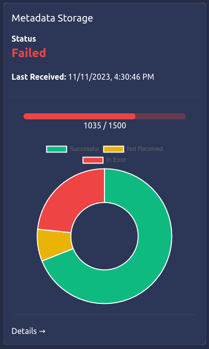
We can see that the fourth card, Metadata Storage, is indicating that the data flow has failed. We can see that the flow expects 1500 documents, but has only received 1035. By hovering over the parts of the donut chart, can see that 115 documents are missing and 350 documents have been found to be in error. Since the last document was received some time ago, this data flow is marked as failed.
Let’s drill into this data flow to see what is going on…
Data Flow Errors
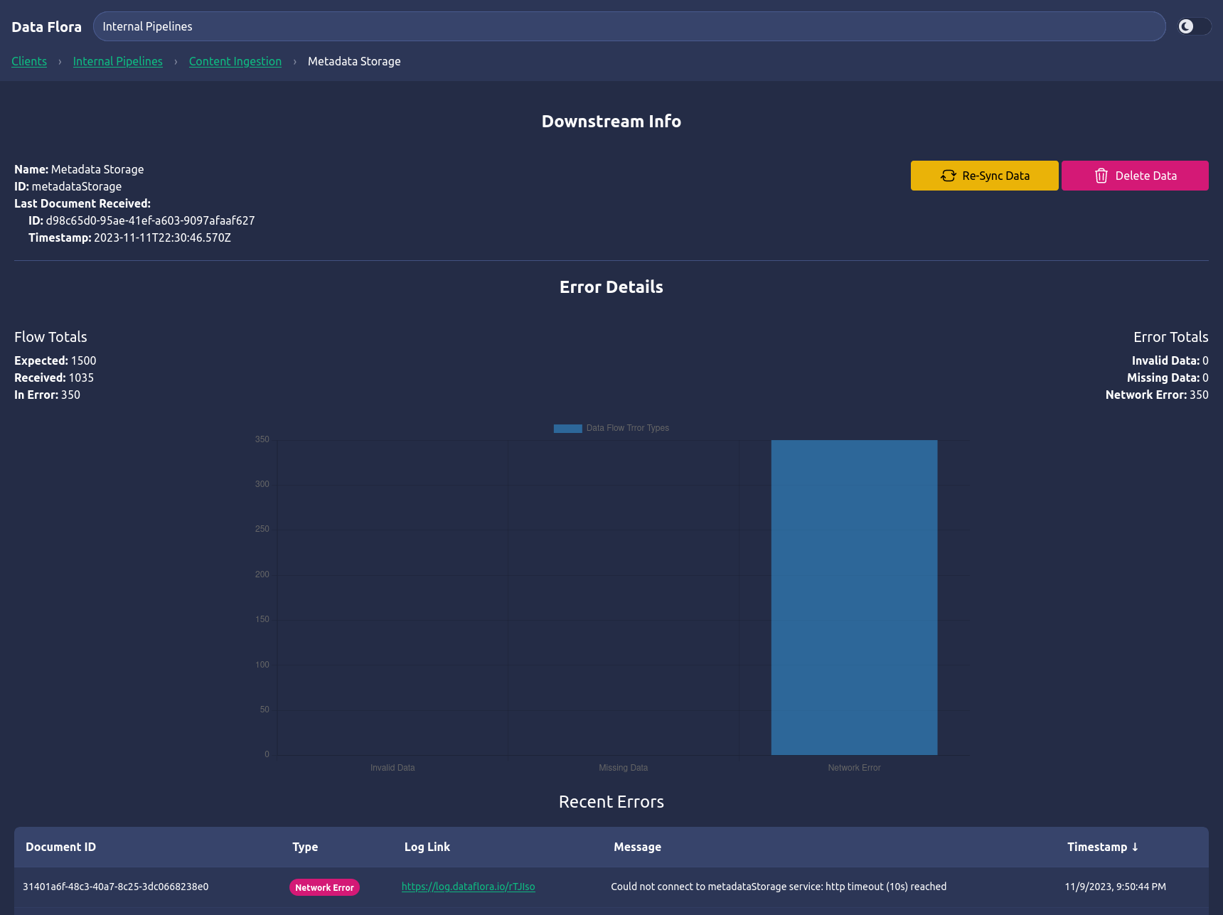
The final page in this data flow example is the downstream error information page. At the top, we can see a few fields about the downstream system we are viewing followed by error detail charting and reporting as well as action buttons we can use to try to remedy issues in our data flows.
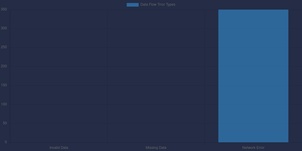
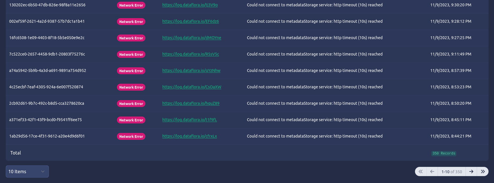
The Error Details section is where we can gain critical insights into what is happening in our systems. We can see the data flow totals of expected vs received and in-error documents, the breakdown of data flow error types, as well as a table representing all of the data flow errors detected by document.
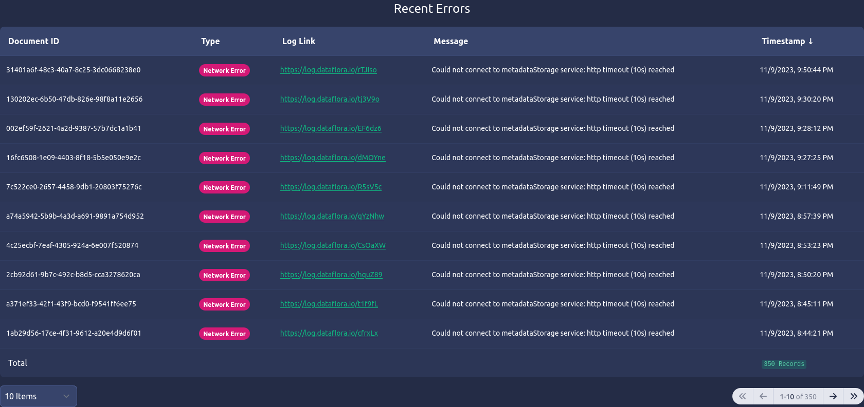
The error detail table is sorted by the timestamp of the document error (descending) and contains the document id in question, its type (in this example, the error type is a Network error, but it could be anything), a link to the log event of this error (could be to Splunk, New Relic, Loki, your custom unicorn log aggregator, etc), the error event message, and the timestamp of the error. Although not shown in this UI, the table would ideally be searchable by fields such as document id and type.
Ok, so. What does this tell us?
Using this tool we can see that the 350 documents in error were caused by network issues. Specifically, a timeout to the “metadataStorage service” meaning that the upsteam system could not connect to our downstream metadata service and failed to deliver the message. Using this information, we can contact the metadata team and then initiate a Re-sync Data action from this tool directly once the issue is resolved.
Taking Action

Now that we have identified potential problem areas, we can take a couple actions directly from this screen.
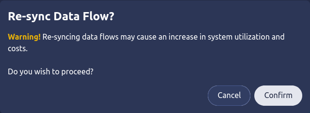
One of the actions is the one we just spoke of in our example: to initate a re-syncronization of the data flowing between this upstream and downstream. This can be especially handy when the engineering teams have resolved a bug in the data flow and we simply need to get the systems back in sync after its resolution. This action calls out the appropriate warning because resyncing data typically has network and storage cost implications.

Another action we can take is to simply delete the data in this downstream system. This may or may not be useful in resolving an issue in the data flow, but it is very handly in exposing this functionality to authorized users (and potentially automation though APIs) to handle data cleanup tasks when a user requests that their data to be removed, deletes their account, or any other GDPR related request. Personally, I’ve found these simple actions to be extremely powerful when dealing with client data (and building systems on the engineering side).
What Do We Gain?
As we continue to build out this functionality through our applications, we start to reveal a “map” of how our data flows through our various upstream and downstream systems from end-to-end (client to end product). The more data we feed into this tooling, the more historical analysis we gather that can be used not only to solve immediate problems but identify trends and predict future problems with data flows.
The immediate benefit is fewer frustrated users. Since we have now provided the necessary visibility and action tooling to our support personal (or even the users themselves in certain cases), we can allow for faster recovery to data integrity issues and improve product performance and reliability. Less support tickets equals happier users, happier support personnel, and happier engineering teams who can spend more time building the fun stuff instead of tracking down bugs.
Speaking of engineers, visibility and management of data flows plays a critical role in the development process. Putting these tools into the hands of our engineers allows for real time feedback of data flowing through QA systems and easy triggers for re-sending and moving test data through these systems while building features and troubleshooting bugs.
Bonus
Increasing the visibility into our data journey can help us in ensuring we are compliant with regulations such as GDPR and HIPAA. We can get early warning and validate that sensitive and private PII data only exists in systems where it is authorized to be. Through the improved tracability and management actions, we are able to gain confidence that we are protecting our user’s data and complying with data privacy requests.
Isn’t This Expensive?
Yes. Definitely. However, I believe that designing with this mindset from the beginning will help keep costs and engineering effort within manageable limits. When working with large data sets, the querying of this data in real time becomes much more costly (both in money and time). While I do acknowledge this and suggest spending design time thinking of how to best query large datasets and weighing the pros and cons of real time reporting vs scheduled aggregations that this tooling can read for less load on critical systems, I truly believe that the value of this visibility and management tooling speaks for itself. Especially when we have large customers feeding us millions of documents every day and expecting that updates are reflected in real time in our products and services.
The ideas discussed here require more effort up front to build but aim to save much more time later on. The “fail fast and iterate” approach may want to write this off at first, but I would argue that this tooling assists in that iterative approach by giving teams visibility in the behavior of the solutions they are rapidly building and allow for more confidence in iterations and further product MVPs.
Give Me the Takeaway
To put it simply… by taking steps to integrate standardized, robust, and cohesive visibility and management tools into the foundational design of data systems, we not only enhance real-time problem-solving capabilities for our teams but also empower our users, reduce support overhead, and fortify our commitment to data integrity, compliance, and seamless user experiences. All of this ultimately paving the way for more efficient and resilient data-driven systems. And what kind of data nerd doesn’t want that?
Data nerds unite!